
EMPATIA
Independent Project | E-Commerce
Curating productive, minimalist workspaces for remote workers
CONTEXT
The remote working landscape is constantly evolving. All the necessary items to create a productive, minimalist workspace are a click away on Empatia.
CHALLENGE
Purchasing products online risks being unsatisfactory when received—leading to returns. Returns are inconvenient for customers and impact profitability for e-commerce businesses.
SOLUTION
Generate accurate visual representations of a workspace tailored to the customer’s preferences using artificial intelligence (AI)— increasing customer satisfaction and reducing return rates.
LOGISTICS
UX/UI THOUGHT PROCESS
WEEK 1: RESEARCH E-COMMERCE INDUSTRY LEADERS AND ERGONOMIC FUNDAMENTALS
Studying the past helps inform the present to further the future.
I choose to research e-commerce trends and the science of ergonomics since my knowledge in both domains is narrow. Doing so expands my understanding and gives me more mental tools for empathizing with remote workers in Week 2.
E-COMMERCE INDUSTRY DESIGN LEADERS
I pick three successful industry leaders and list my likes, dislikes, key takeaways, and specific action items on each leader’s website.
Studying how industry giants navigate changes in technology, customer needs, and best practices keeps me ahead of trends and guides the interface’s direction for my project.
Pictured below is one of my analyses.
ERGONOMIC FUNDAMENTALS
I read empirical research articles about ergonomics, productivity science, and best practices for workspace habits to understand how to create productive workspaces.
Studying the small details of ergonomics provides historical and contextual information about its development to help me identify preconceived notions, existing behaviors, and future trends in the field.
WEEK 2: SURVEY REMOTE WORKERS
My survey targets to gather evidence about remote work life to inform user interface decisions. What do remote workers consider essential workspace items? What are their feelings about remote work? Where do they work the most? I survey 25+ remote workers to use qualitative and quantitative data to answer these questions.
Included below is a selection of the survey data.
KEY FINDINGS
The data shows most people value their workspace environment, placing moderate to high importance on having a productive workspace.
Participants view remote work as having two critical challenges: isolation and distractions.
The most common work advantage listed was flexibility.
Participants listed their homes as the most common place they work.
Over 80% of participants consider laptops/desktops, desks, and chairs essential for their daily workspace.
WEEK 3: IDEATE A WEBSITE
USER FLOWS
User flows outline the steps to navigate the Home page and click the Call to Value button, which leads to the AI generator. They also identify areas of confusion and optimize navigation to the Final Product screen.
Pictured below is a portion of a user flow.
WEBSITE WIREFRAMES
Wireframes are my visualization tools that serve as the blueprint for my user interfaces. In addition, they help me ensure all elements are addressed and create a necessary order of execution when designing high-fidelity mockups in the following week.
Pictured below are a few of my wireframes.
WEEK 4: DESIGN MOCKUPS
COLOR PALETTE
I aim for a simple, calm palette to make customers feel they can trust us. At the same time, I keep accessibility in mind by ensuring all text and background color combinations pass the Web Aim Contrast Checker with flying colors (pun intended).
TYPOGRAPHY
Avenir was my first choice for the display text because it complements many fonts while still carrying its elegance. I view Nunito as usable for both display and text fonts, but it was an easy choice for a text font because of its beautiful Sans Seri balance with round corners.
MOCKUPS
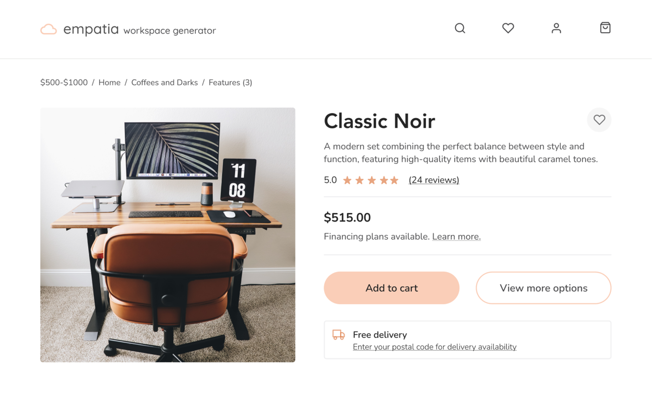
The transformation from wireframes to high-fidelity mockups. This is why I love UI design.
WEEK 5: USER TEST WITH REMOTE WORKERS
I conduct two rounds of usability tests with remote workers to gain feedback for design iterations while being mindful of their time.
🔍 View the entire test script here.
ISSUE #1: NO SKIP OR BACK BUTTON
Solution: Buttons were the main issue brought up in user testing. Not having a button to go back or skip a question made users feel constrained, and some users said the unselected Next button looked like it was selected, which was confusing. I added the Back and Skip buttons and lightened the unselected Next button.
Impact: An increase in user control, freedom, and clarity.
ISSUE #2: ARBITRARY ORDER OF STEPS
Solution: When testers commented on the random order of questions, I realized the significance of organizing them in a descending order based on the level of concern. As most users stated that price significantly influences their purchase decisions, I placed it as the first question. Meanwhile, color choices and additional features were placed near the end since they are considered amenities.
Impact: Questions are presented in a logical and predictable format, making the experience easier to process.
ISSUE #3: INABILITY TO FAVORITE ITEMS
Solution: Testers suggested adding a “Favorite” or “Save” button next to individual items for easier future reference.
Impact: Enhanced connections between customers and the product, creating a sense of personalization.
THE FINAL PRODUCT
💻 Desktop/Laptop Users: You can directly interact with the prototype below and expand its screen for the best experience.
📱Mobile Users: You can interact with the prototype on your mobile device, but I’d recommend viewing it on your desktop/ laptop for a better experience!
PERSONAL TAKEAWAYS
1) Designing a website is similar to building a house
One of the reasons I fell in love with UI design is that I can take any idea in my brain and transform it into a beautiful interface for my eyes to see. Designing an interface is similar to building a house; all parts must harmonize to create a practical yet aesthetic product. For me, it’s always worth investing in the small details as it’s rewarding to look back and be proud of what you’ve created.
2) Communicative design is a phenomenal design
Customers value designs that reflect their feelings and experiences. From tailoring a beautiful color palette to choosing appropriate typography, creating with communication, intention, and thoughtful consideration delivers a powerful statement to the customer.
3) Trust your curiosities and be fearless in exploring them
Curiosity is an innate trait within us all. However, somewhere along the way, as we grow up, we’re discouraged from asking questions and praised for conforming to the norm. I prefer asking all the questions, challenging myself, and pushing myself to explore design. More possibilities arise when you follow your curiosities.