NAVIX HEALTH
Internship | Healthcare Software
Creating a user-friendly time log system for behavioral healthcare clinicians
CONTEXT
Clinicians using Navix Health typically lack sufficient time in their workday. A user-centered redesign of Navix’s time log system is needed to help them input and track their hours accurately and efficiently.
CHALLENGE
Clinicians reported feeling uncertain when recording and monitoring their hours per pay period due to ambiguity issues in the current time log system.
SOLUTION
Replace extraneous time log features with essential benefits based on user feedback to provide clarity for clinicians to log and track their hours.
LOGISTICS
UX/UI THOUGHT PROCESS
WEEK 1: EMPATHIZE WITH CLINICIANS
I conduct a user survey and user interviews with clinicians to identify their pain points and frustrations in their current time log system.
Based on the research, I identify the main issues, determine the key insights from the user research, and set the desired outcomes for the redesign.
IDENTIFIED ISSUES
Ambiguity in calculations and travel miles recording results in inaccurate representations of driving time.
Absence of a timesheet to review past pay periods or delete logs from current pay periods.
Lack of clarity in job task specifications, resulting in clinicians sometimes choosing incorrect work tasks.
KEY INSIGHTS
Miscommunication in expectations around time logging creates uncertainty among clinicians.
A timesheet feature is necessary to ensure accurate time tracking and foster more visibility between the clinicians and the software.
Clinicians require rapidity and efficiency for their time-logging process, as their time is limited.
CLINICIANS’ DESIRED OUTCOME
“We need clearer and more transparent tracking of our time so that we can ensure we are receiving fair compensation for our work.”
WEEK 2: SYNTHESIZE USER RESEARCH
By synthesizing the data, I make connections between research results and identify any key points I may have overlooked during Week 1.
EMPATHY MAPPING
Creating an empathy map gives me a holistic picture of the user experience and identifies potential opportunities and improvement areas. The map is also one of the easiest ways for me to absorb user research data since I’m visual.
USER PERSONAS
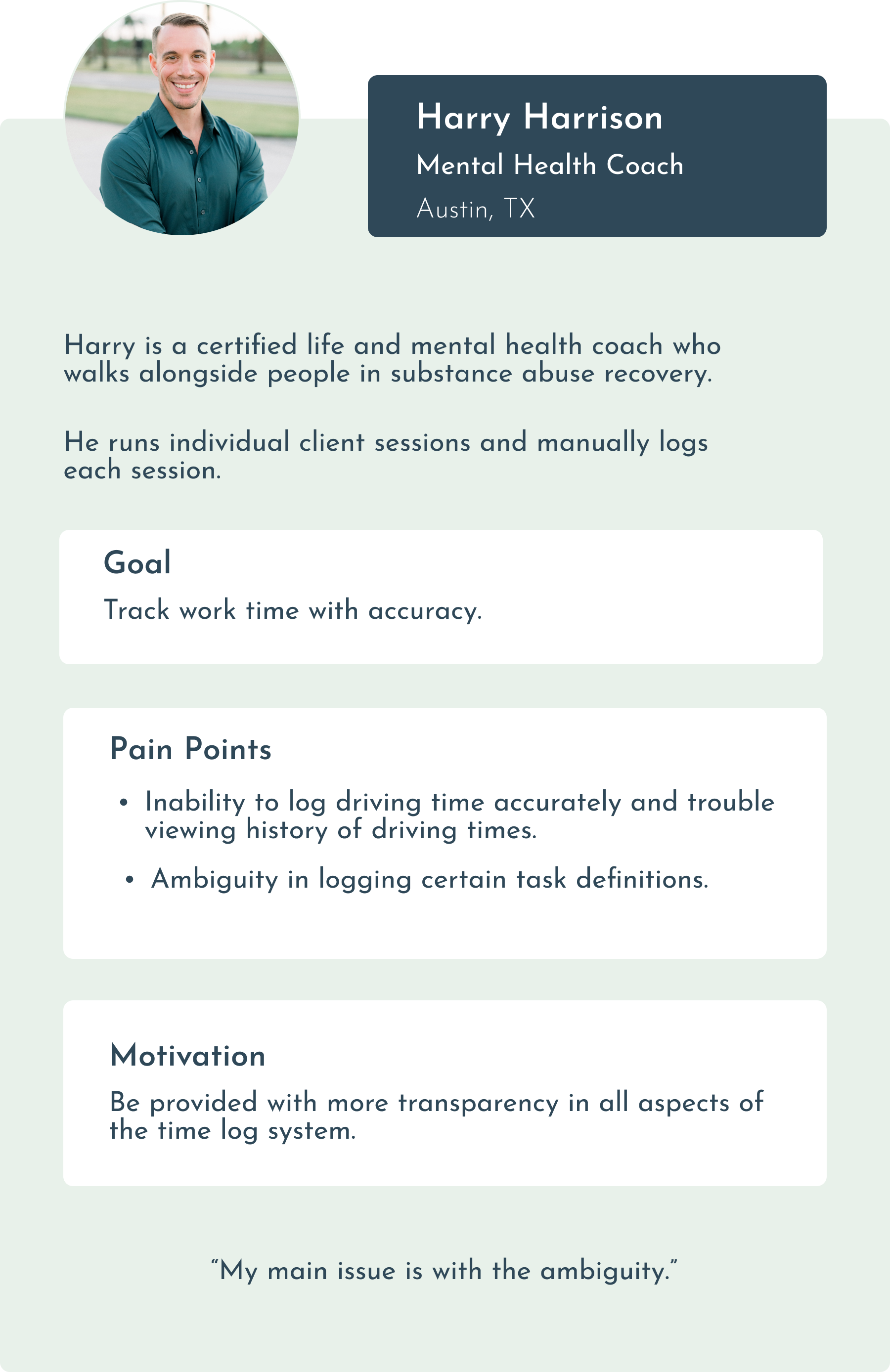
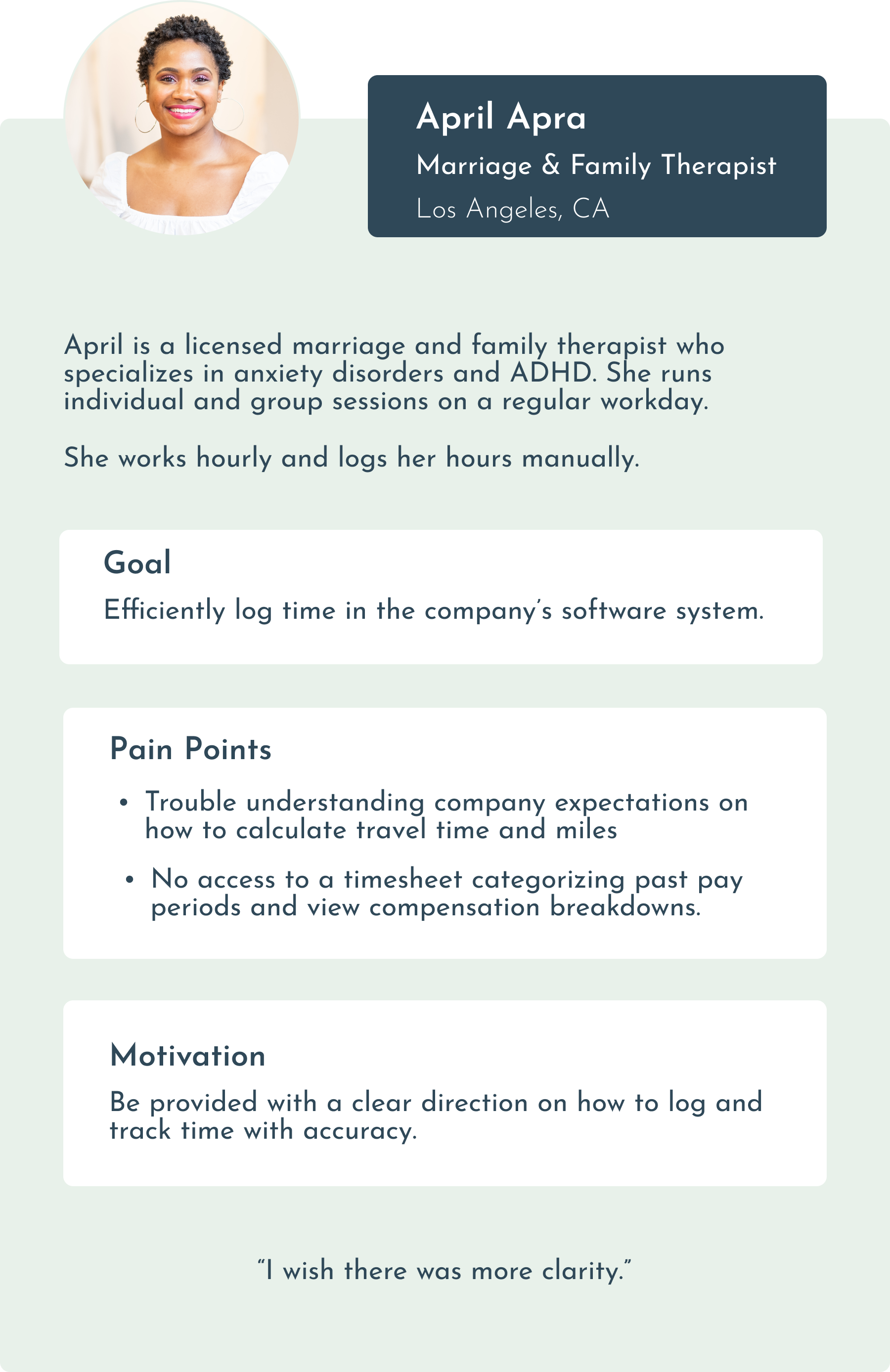
To bridge the gap between my role as a designer and the roles of the developers I work with, I create user personas to serve as an accessible way to keep in mind the target audience and yields of the final result.
WEEK 3: IDEATE A SOLUTION
USER FLOWS
Streamlining the design process helps me consider all critical elements and provides a strong starting point for the user’s journey from beginning to end.
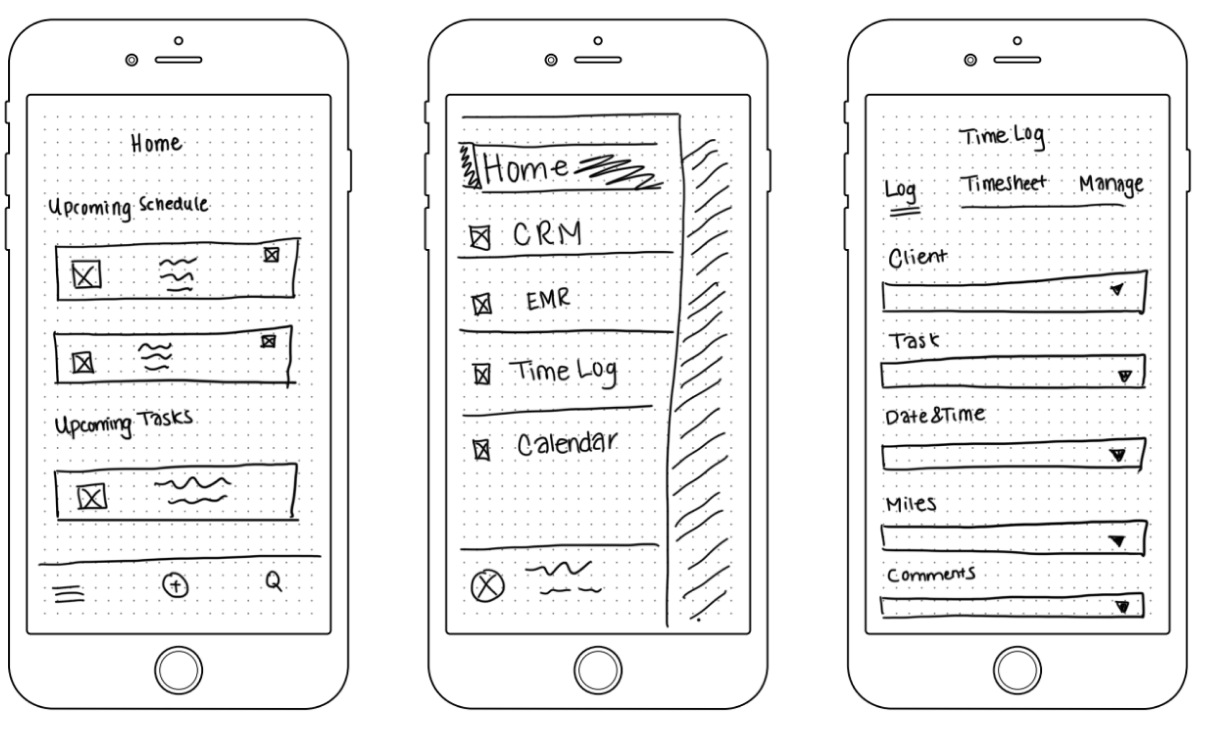
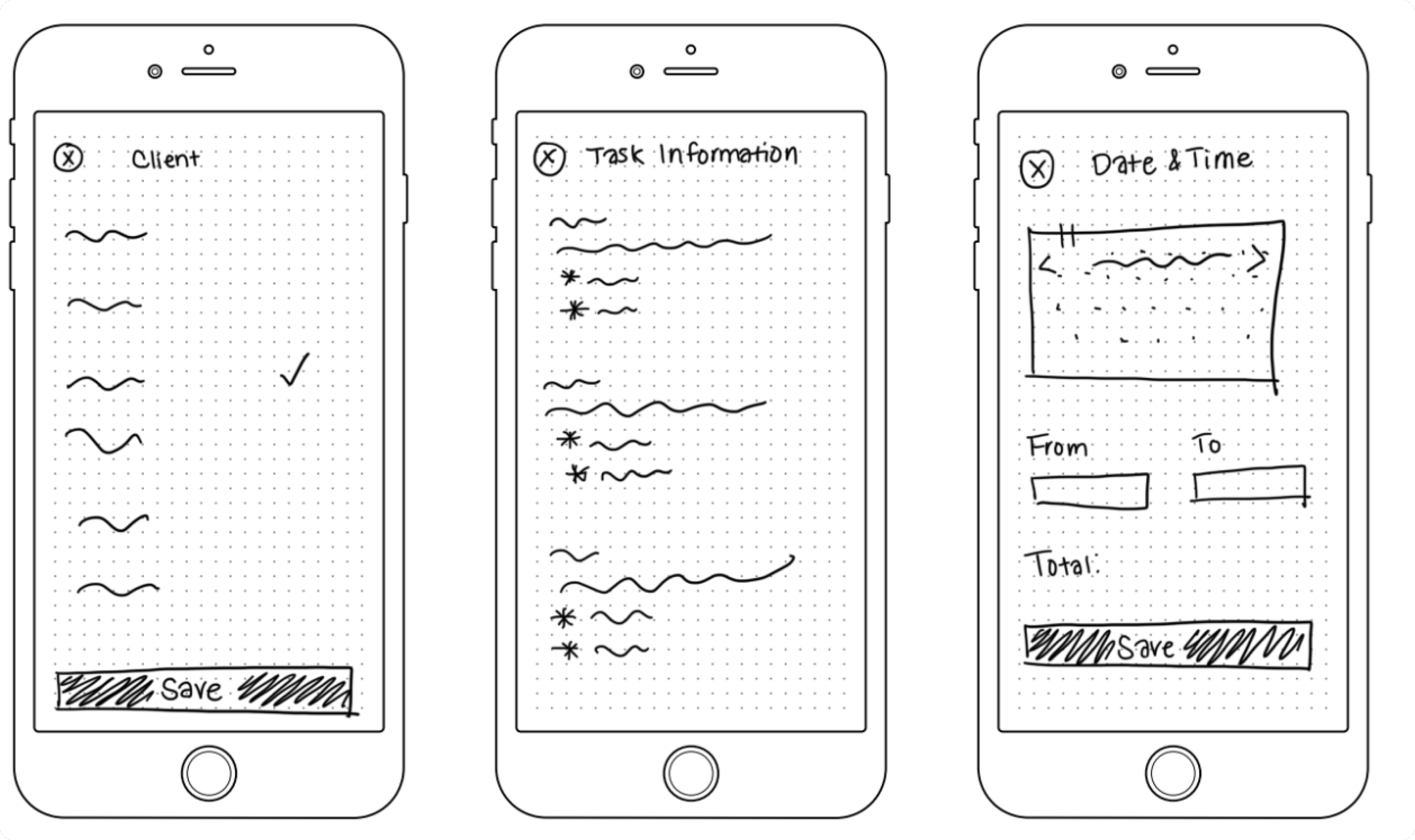
SKETCH SCREENS
Sketching designs allows me to iterate quickly without being hindered by technical constraints. Not only does it make it easier to brainstorm ideas, but it also gives me multiple approaches to try and discard different ideas.
WEEK 4: PROTOTYPE A POTENTIAL OUTCOME
WEEK 5: TEST WITH CLINICIANS AND ITERATE DESIGNS
I contact clinicians over email and WhatsApp to conduct usability tests over Zoom with them. In between testing, the branding team tweaks the color palette with darker shades, and I apply the UI changes accordingly.
The top three testing issues are as follows:
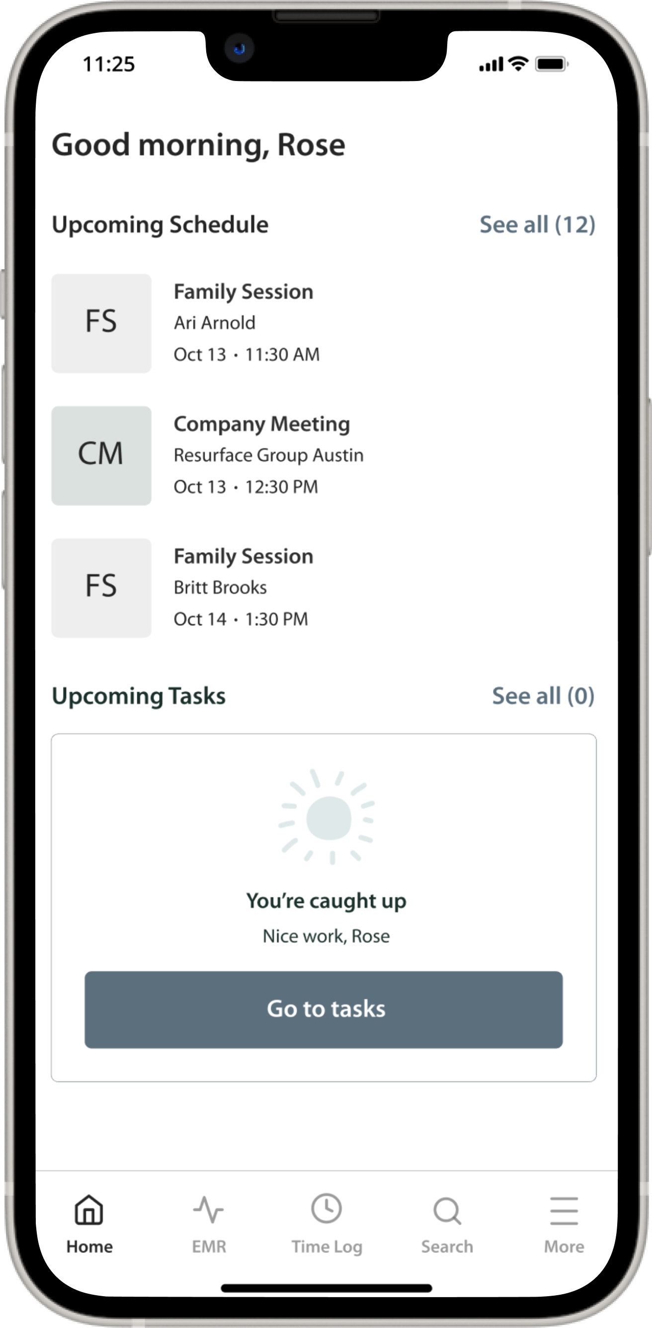
ISSUE #1: NO CRM TAB IN THE MAIN NAVIGATION BAR
Solution: I relocated the search icon from the navigation bar to the Home Screen, replacing it with a CRM tab.
Impact: Clinicians of higher seniority reported using the CRM to monitor client leads and daily tasks, making it a necessary feature on the navigation bar. This change gives users more control.
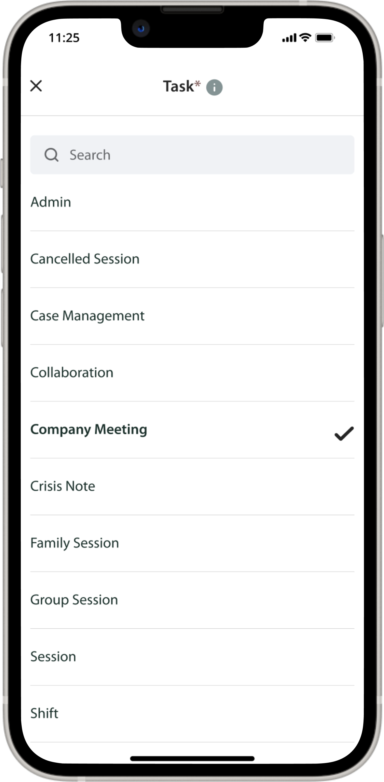
ISSUE #2: CLIENT/COMPANY DROP-DOWN IS ON THE SAME LINE
Solution: Testing showed a preference for placing the Company drop-down in one line and the Client drop-down in the following line, despite the limited selection in the Company category.
Impact: A decrease in ambiguity, thus leading to greater user trust.
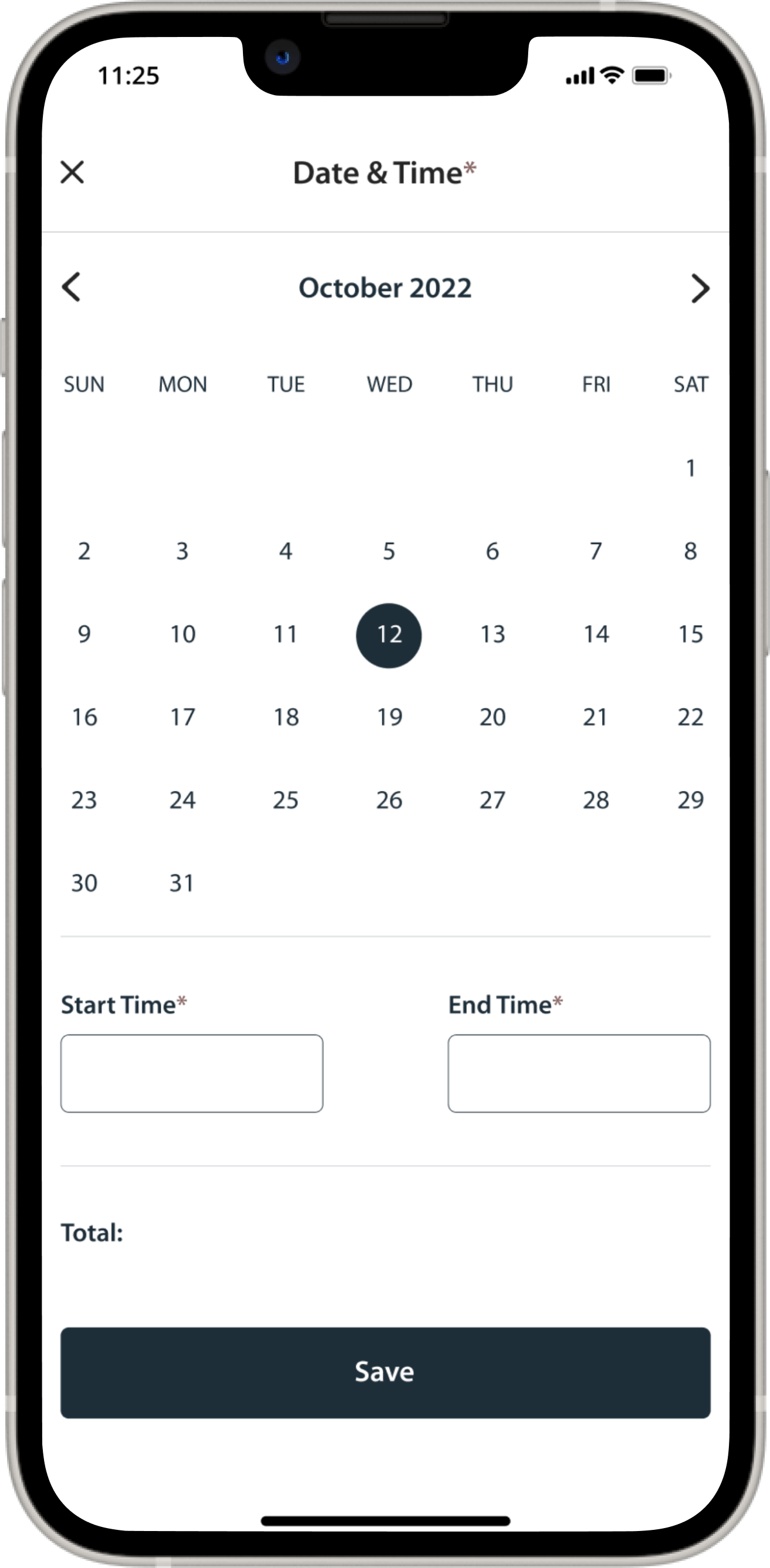
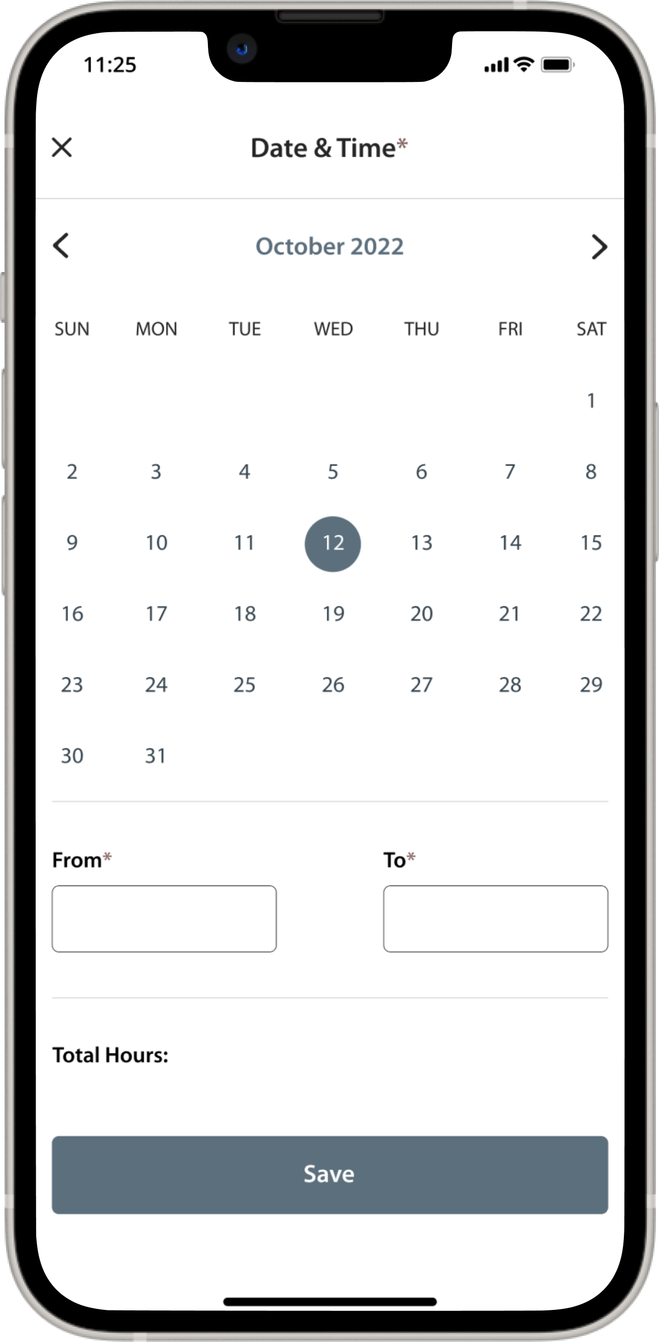
ISSUE #3: THE “FROM” AND “TO” LINE TITLES IN THE DATE & TIME DROP-DOWN IMPLY ENTERING MILES RATHER THAN INPUTTING A TASK TIME
Solution: Replacing “From” with “Start Time” and “To” with “End Time” to make it more intuitive.
Impact: Making a product intuitive helps users quickly and easily navigate the provided features and information, reducing the number of steps needed to accomplish simple tasks.
THE FINAL OUTCOME
💻 Desktop/Laptop Users: You can directly interact with the prototype below and expand its screen for the best experience.
📱Mobile Users: You can interact with the prototype on your mobile device, but I’d recommend viewing it on your desktop/ laptop for a better experience!
PERSONAL TAKEAWAYS
1) Remain aware of product constraints
Feeling overwhelmed when faced with an extensive UX/UI to-do list is expected. I set realistic goals and compartmentalized tasks according to deadlines, importance, and complexity to remain on track. Doing so makes me confident I can complete them within an appropriate time frame.
2) Don’t lose sight of your target users, but remember your users aren’t always right
The clinicians and their experiences were my primary focus when designing the time log system. By understanding their needs, wants, and desires, I was better equipped to ascertain user satisfaction. At the same time, I must remind myself that user feedback does not always reflect user preferences. For example, a user may mention something others don’t echo after interviewing them. User feedback is incredibly valuable, but I remain cautious not to rely solely on it.
3) Adaptability is a powerful skill to develop in UX/UI design
I worked through 100+ iterations in the design process. My supervisors were making minor changes, and I had to stay ahead. I adapted and rode the wave of change rather than be overtaken by it.


