
TINY TALES
Design Sprint | E-Books
Saving parents time when finding a bedtime story for their children
CONTEXT
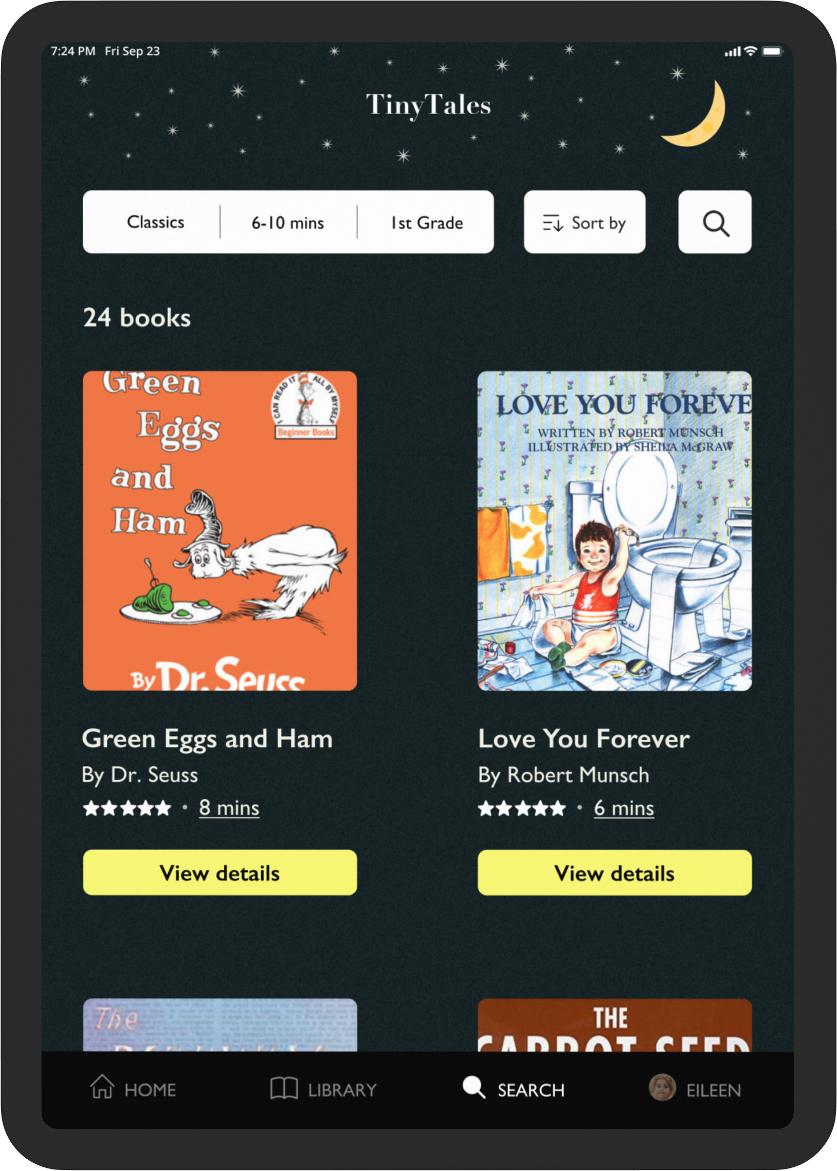
Parenting is hard enough. Tiny Tales saves parents time and energy when choosing a bedtime story for their children.
CHALLENGE
Parents spend more time choosing a bedtime story than reading it with their children.
SOLUTION
Simplify the book selection process by asking brief, concise questions to filter high-quality search results based on the parent and child(ren)’s reading preferences.
LOGISTICS

UX/UI THOUGHT PROCESS

DAY 1: EMPATHIZE WITH PARENTS
The Google Ventures Design Sprint team provided user research for Tiny Tales.
I synthesize the research into three parts: the challenge, the key insights, and the parents’ desired outcome.
CHALLENGE
Parents overspend time searching for a bedtime story, wasting valuable reading time with their children.
KEY INSIGHTS
Age range and reading time are huge factors when narrowing down options.
Parents don’t read through book options— they scan them.
Reading enjoyment and educational value hold equal importance for parents when choosing a book.
PARENTS’ DESIRED OUTCOME
“Spend less time searching and more time reading an enjoyable, educational story with my child.”

DAY 2: ANALYZE PAST SOLUTIONS
I absorb UI/UX inspiration by analyzing small details other companies used to solve similar design problems.
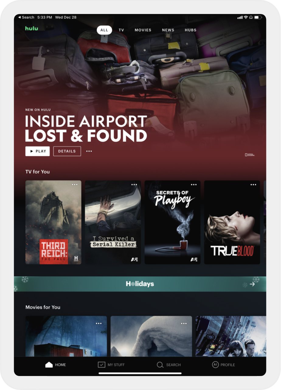
HULU’S COLOR PALETTE
The dark, warm tones give the app a cozy feel- promoting relaxation as users navigate their options.

AIRBNB’S SEARCH FILTER
The filters tab asks only for the most relevant information to generate better search results.
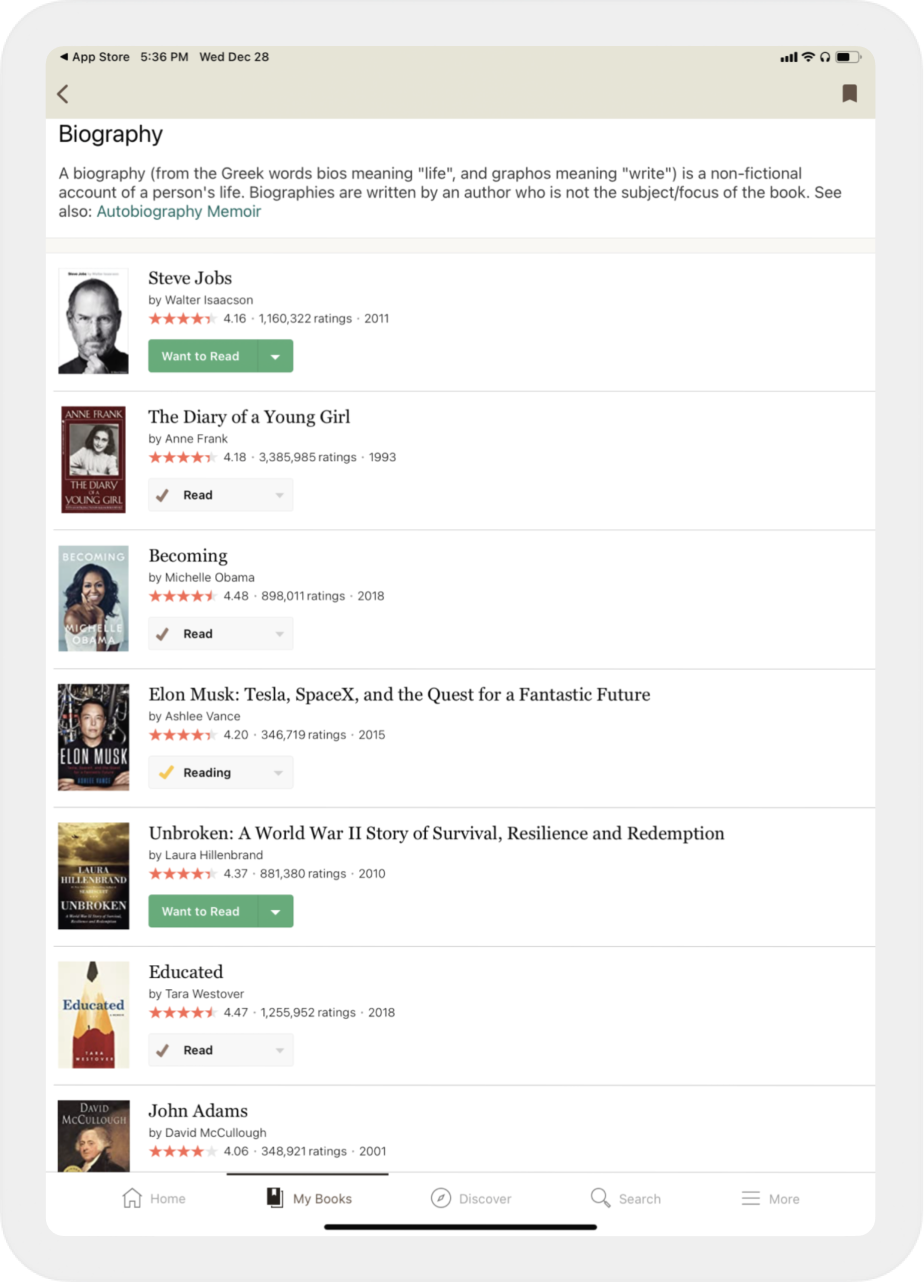
GOODREADS’S HIERARCHY
General book information is organized by an intentional order of importance, helping users scan and decide faster.

DAY 3: IDEATE A POTENTIAL SOLUTION
FROM CHAOS TO SIMPLICITY
I exercise the Crazy 8’s Method to optimize my time (given the tight deadline). I note the most complex and critical screens to prepare for the design process ahead of me.


🍋 COMPLEX SCREEN
Many variations can be chosen for the books’ information architecture. The structure must be intuitive and digestible.
🍎 CRITICAL SCREEN
The filters screen will make or break the quality of the search results, and its effects will permeate throughout the entire user experience.
POTENTIAL SOLUTION OUTLINE


DAY 4: PROTOTYPE THE OUTCOME
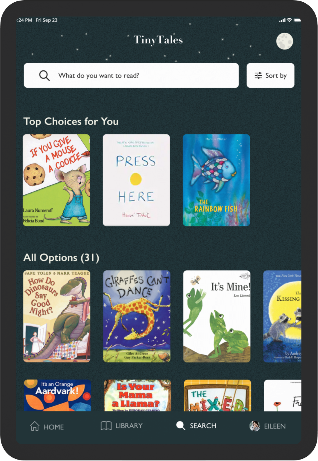
I try achieving a warm, simplistic look while giving minimal options that fulfill the users’ needs.




DAY 5: USER TEST WITH PARENTS
I contact parents with young children through Slack and conduct usability tests over Zoom.
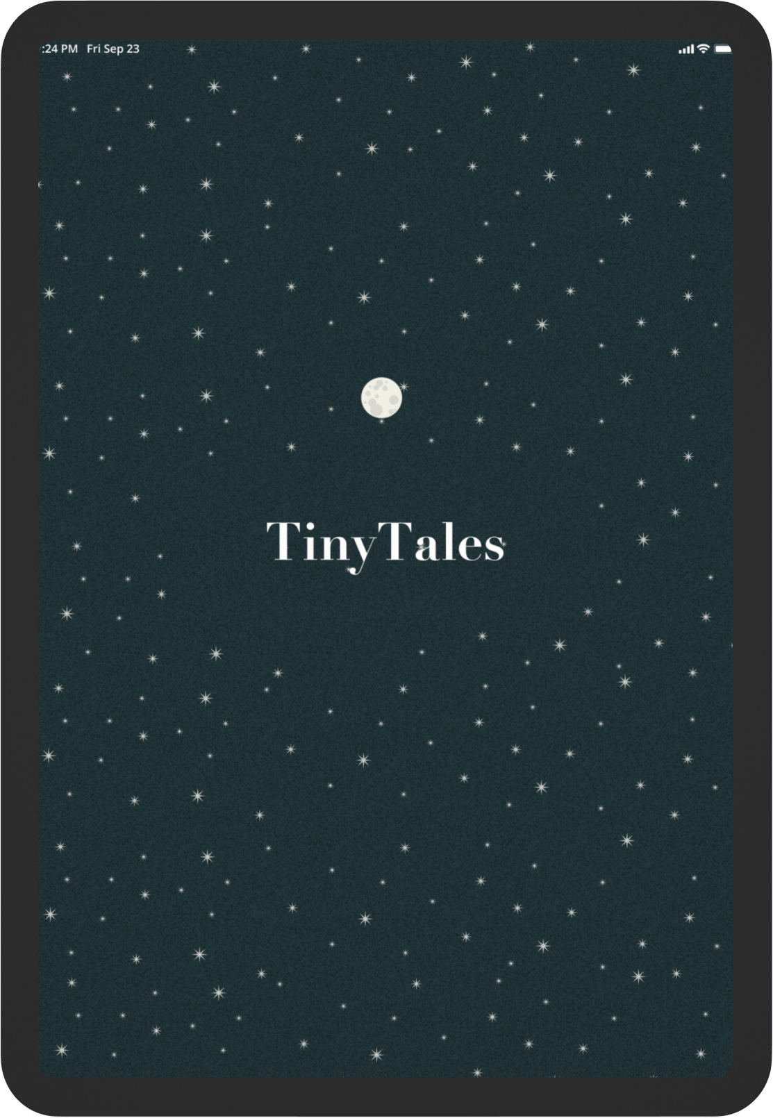
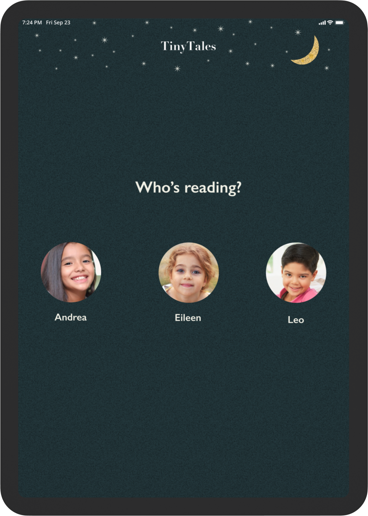
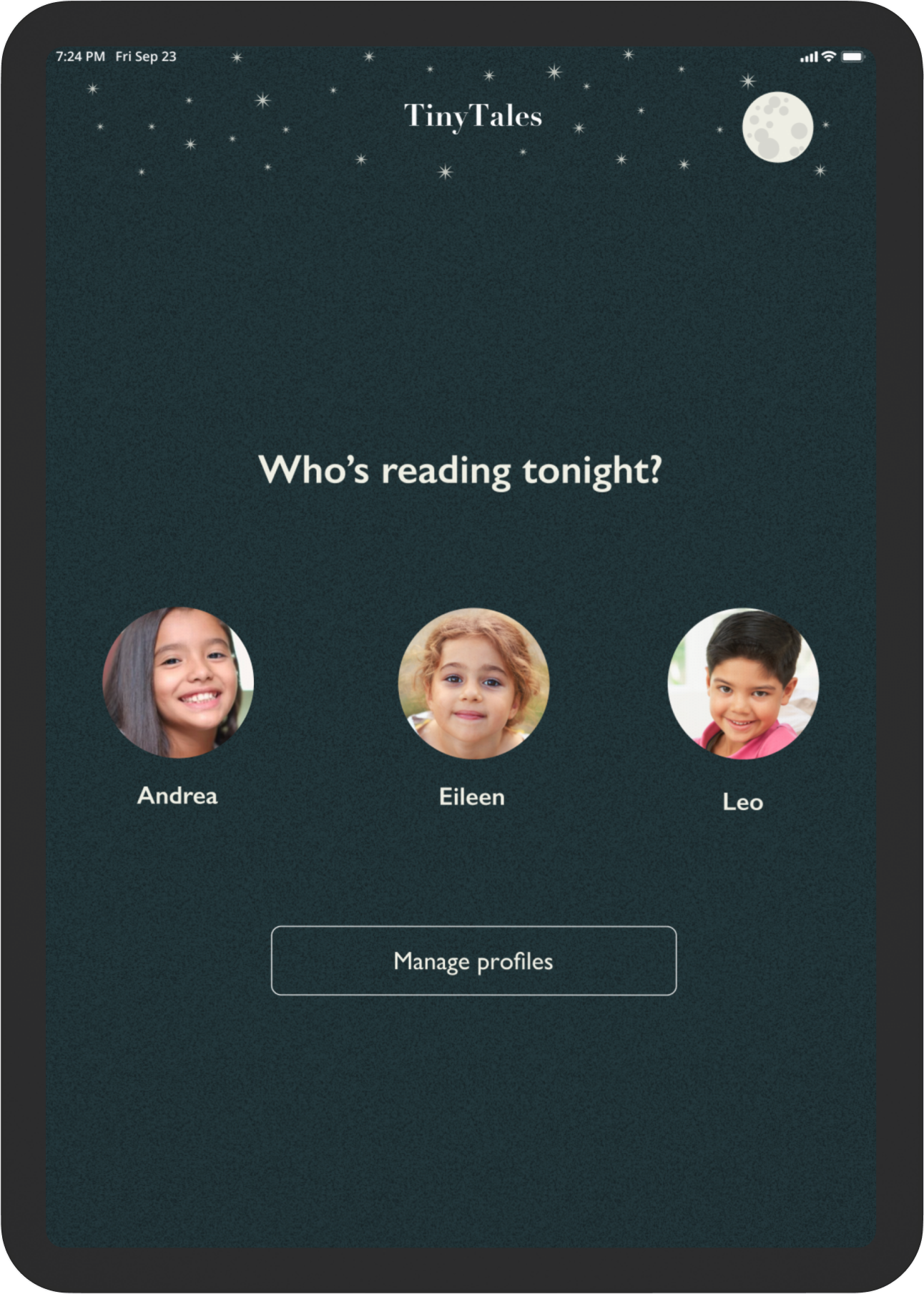
ISSUE #1: FULL MOON IMAGE CONFUSED FOR A BUTTON
Solution: I replaced the full moon with a quarter moon image on all screens, since 4/5 users tried clicking on the moon thinking it was a button.


ISSUE #2: REDUNDANCY IN AGE RANGE AND READING LEVEL FILTERS
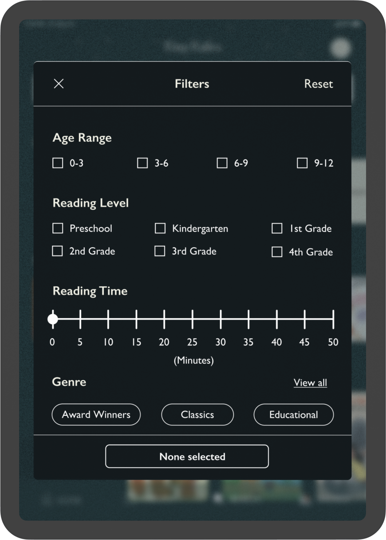
Solution: Since users mentioned the Age Range and Reading Level filters are interchangeable, I changed the filter option to ask for the preferred reading level based on the child’s current grade level.


ISSUE #3: USERS TRIED SCROLLING VERTICALLY INSTEAD OF HORIZONTALLY
Solution: On the screen showing book options, all users tried scrolling down rather than to the right to view more options. Two users mentioned scrolling vertically felt more intuitive, and I applied the changes accordingly.


THE FINAL OUTCOME
💻 Desktop/Laptop Users: You can directly interact with the prototype below and expand its screen for the best experience.
📱Mobile Users: You can interact with the prototype on your mobile device, but I’d recommend viewing it on your desktop/ laptop for a better experience!
Personal Takeaways
1) Learning about the Productivity Paradox
Before beginning this project, I was setting rigid and lengthy work hours, which created a few unproductive periods. The Design Sprint taught me I can be more efficient by working in sprints, taking breaks, and repeating the process.
2) Practice patience, then practice it again
My biggest challenge in this project was balancing remaining creative and working on a tight deadline. I’m learning to be as patient with myself as I am with the design process. Doing so opens more doors to learning from my mistakes and experiences.
3) “You don’t have to be great to start, but you have to start to be great.” -Zig Ziglar
The Design Sprint Challenge was my favorite UI/UX project. The fear of being wrong on day one was replaced by the thrill of progressing on days 2-5. With the fast-paced nature of the challenge, I felt I gained more momentum and optimism from the time pressure.
